SaavySpaces
End to end Mobile App
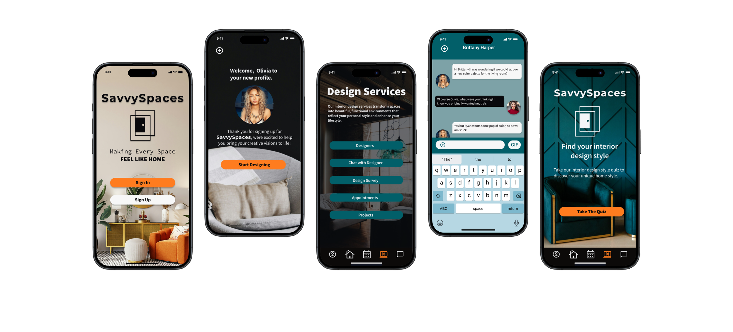
SaavySpaces transforms your home furnishing journey. Connect with expert designers, discover your style with our interactive quiz, and effortlessly pair existing pieces through our intuitive app. Chat directly with designers for personalized advice, and create your dream space with confidence
Background
As a passionate interior design enthusiast, I've explored a range of companies offering home decor and furnishings. One consistent observation is that many of these companies focus on a single style, making it challenging for customers seeking to mix and match pieces for a cohesive home design.
Through user interviews, I discovered that the moving process often overwhelms people. This stress can lead to hesitation in furnishing their homes, as it feels like yet another daunting project. Many users lack design experience, making it difficult to start furnishing within their budgets. That’s where SaavySpaces comes in—our all-in-one app simplifies the home furnishing process, empowering users to create their dream spaces with ease and confidence.
The Problem
New movers frequently experience overwhelm when it comes to furnishing their new spaces, especially if they have limited budgets and lack design experience. Without clear guidance or accessible resources, many find themselves navigating the process alone, often leading to overspending on home projects.
This challenge underscores the necessity for personalized support that empowers new movers to make informed, budget-conscious design choices. Providing tailored resources can help them transform their spaces with confidence and creativity.
The Solution
Having a centralized app for new movers to help design and furnish their home would be an idea of a physical planner.
Creating an app that would give new movers and ease when it comes to furnishing their home within their budget by having a one stop shop app instead of using multiple stores and websites would get confusing especially when trying to pair pieces together.
Research
As I embarked on this project, my initial goal was to develop an app aimed at facilitating community building or helping individuals find the best neighborhoods in a new city. However, after conducting interviews, I discovered a common challenge among those moving: the need to furnish their new spaces. This insight shifted my perspective entirely. I realized that people often concentrate on the logistics of moving, neglecting the equally important task of creating a comfortable and personalized home. This revelation has inspired me to focus the app’s features on simplifying the furnishing process for new residents.
Research methods
Competitive Analysis
All four companies are some of the top leading providers for users who are furnishing their home.
Design services were a free service for that 3 of the 4 companies offered their customers, which include in-home or virtual appointments, mood boards and 3D renderings.
Each company lacked the service of using customers current decor and furniture pieces to add to their new pieces they are interested in.
Crate and Barrel was one of the few companies that had a huge childrens furniture section which is great for families who want to buy everything with one brand.
User Interviews
After conducting 5 user interviews, who each had different moving experiences from purchasing their first home or new apartment, I created an affinity map to categorize the key topics based on the similarities in user feedback. This process revealed a consensus among participants: the primary focus was on furnishing their homes. Initially, my objective centered around a community app for those moving to new spaces. However, drawing from my background as an interior designer, I recognized a significant gap in the market. There is currently no comprehensive app or website that guides users through the entire furnishing process, unless they hire a designer, which can be prohibitively expensive.
Personas
Next I took the insights and observations gained from research and created two personas that embodies the target audience's needs, goals and pain points. Kristy and Nicole serves as a guiding reference through the design process, ensuring that every feature and interaction aligns with SaavySpaces real life challenges and aspirations for new movers. They keep their journey in mind which the apps design reminds them of being user centered and empathetic. Meet them Below:
User Flow
By creating a comprehensive user flow for SaavySpaces, I effectively mapped out the most intuitive pathways for users to achieve their design goals. This process began with a streamlined sign-in/sign-up task flow, seamlessly guiding users through key decision points, such as the design services flow. This flow incorporates a user-friendly design quiz, facilitating optimal designer matching. Furthermore, I included a dedicated flow for managing past and current projects, enabling users to explore the work of others while seamlessly tracking their own progress. Through this meticulous visualization of each step, I ensured a smooth, goal-oriented experience, minimizing friction and enhancing user navigation to perfectly align with their specific needs.
Design
Initially going into the design creation phase of the low-fidelity wireframes I didn't want to sketch because I wanted to be able to edit, add or change to my screens instead of re-drawing everything. This allowed me to focus on the layout, navigation and functionality without getting distracted by visual details. When I started this process I started off with a few key screens which would help validate my ideas and father feedback before I made all the screens and moved to the high-fidelity designs.
Low-Fidelity Wireframes
Branding of savvyspaces
Next came the exhilarating stage of branding, where the vision for SaavySpaces truly began to take shape! I started the process by creating a mood board, which allowed me to gather and visualize various inspirations, colors, and design elements that resonated with the concept of the brand. Alongside this, I utilized low-fidelity wireframes as a foundational guide, providing a structural blueprint that would help me in developing the overall look and feel of the website.
The SaavySpaces logo emerged from this creative exploration, crafted with careful consideration to ensure it encapsulated the core values of fun, family, and new beginnings. To emphasize these themes, I drew inspiration from the metaphor of a door that is waiting to be opened. This imagery serves as a powerful symbol of opportunity and exploration, aiming to evoke a sense of curiosity that invites users to delve deeper into what SaavySpaces has to offer. I wanted the logo to not only represent the brand visually but also to create an emotional connection with potential users, encouraging them to discover all the wonderful experiences that lie behind the metaphorical door.
In terms of color, I selected a palette that blends both cool and warm tones, fostering a vibrant atmosphere that sparks excitement and engagement. The balance of these colors reflects the emotions of joy, warmth, and inspiration, inviting users to interact and explore the platform fully. Each hue was chosen deliberately, with the intention of creating a welcoming environment that resonates with families and individuals embarking on new beginnings.
After establishing the foundational elements of the logo and color scheme, I turned my attention to assembling the SaavySpaces UI Kit. This involved a meticulous selection of design elements, including buttons, icons, typography, and other components that would contribute to a cohesive and intuitive user interface. My focus was on creating a user-friendly experience that aligns seamlessly with the app's values, ensuring that every design choice would facilitate engagement and resonate with the audience. Each element was crafted to support the overarching themes of family-friendliness, inspiration, and new beginnings, ultimately bringing the vision of SaavySpaces to life in a way that is both functional and visually appealing.
High-Fidelity Wireframes
Leveraging research and usability test results, I developed the SaavySpaces high-fidelity wireframes in Figma, prioritizing an intuitive and user-driven experience
To enhance the SaavySpaces user experience, I developed wireframes for key functionalities: User Profiles, Designer discovery, personalized matching, style quizzes, appointment scheduling, and project galleries. These wireframes prioritize user interaction, creating a cohesive design platform
Usability Testing and Refinements
To bring SaavySpaces to life for testing, I created an interactive prototype using figma which helped simulated key user flows and allowed me to validate the apps functionality and design. I was able to map out the essential actions such as making a new user profile, taking the design quiz, matching with a designer, scheduling an appointment, all by creating clickable components and linking screens with transitions.
The outcome was to valaide the prototypes, so then I conducted usability testing with 5 ideal users, which allowed them to interact with the apps core features. I observed how users engaged with interactive prototypes and gathered feedback on usability, task completion and overall satisfaction.
Create a new user account
Design services: Take the design quiz and match with a designer
Schedule an appointment and chat with your designer
I let my participants know that this was in no way a test but rather an open session for them to share candidly their thoughts about the product as they used the prototype. From this usability test, I was able to gather really good feedback and data on things people liked and didn’t like about the app so far. Most of the users had similar changes such as the way the design services buttons were set up, changing an icon in the designer chat from a typography symbol to a paperclip which showed easy attachments and added a my projects page so the user could see their current projects.
TASK COMPLETION RATE:
100%
What Worked
All users thought the sign up process was easy and very straightforward to use
Users loved the layout of the app and loved the coors and and branding made it appealing to explore.
What Needs Work
Some users struggled navigating the design services and were confused by why the design quiz wasn’t the first button.
Users didn't like the + iconography and wanted a different symbol to attach pictures in the designer chat.
Refining the Prototype after usability testing
Ultimately, the success of the application's redesign stemmed from a steadfast commitment to incorporating user feedback. Through a detailed analysis of usability testing results, I was able to pinpoint areas for improvement and implement targeted adjustments that significantly amplified both user engagement and accessibility. These modifications, while seemingly subtle, created a more seamless and intuitive experience, demonstrating the profound impact of user-centered design principles
Problem 1 ( Figure 1)
Users indicated it was strange to have a + iconography symbol for attaching photos; they didn't really understand the reason behind it and wanted something that would show a better attachment symbol.
Solution ( Figure 2 )
Changed the iconography to a paperclip symbol which clearly made it more accessible for users to know it was for attaching photos or attachments.
Problem 1 ( Figure 1)
An issue with the users all said that they would like the design services feature to have design quiz first instead of seeing the designers first.
Solution ( Figure 2 )
To address this issue, I went in and changed the order of how the buttons were set up and made the design quiz first since this would be the first time for most users to be using the app.
Future Roadmapping
My future roadmapping would include the outline below:
For the design quiz, I would incorporate a wider variety of options for users to select from, ensuring they can discover a design style that truly resonates with them.
I would maintain ongoing usability testing to enhance the app according to user feedback, ensuring it effectively meets the needs of new movers.
My Reflection:
I recognize that conducting a greater number of user interviews and reaching out to individuals beyond my immediate circle of friends and family would have significantly helped the research process for my app. While I did gather some valuable insights during my initial interviews, I couldn't shake the feeling that many participants were hesitant to provide candid feedback due to our personal connections. This apprehension likely stemmed from their desire to avoid hurting my feelings or disappointing me, which ultimately created a barrier to obtaining the honest and constructive criticism I desperately needed. As a result, I found that some of the feedback I received was overly positive or lacked the depth required for meaningful analysis, making it challenging to identify areas for improvement. To enhance the validity of my research, I would have actively sought out a more diverse group of potential users—individuals who could offer a broader range of perspectives and experiences.
I discovered the critical importance of developing wireframes early in the design process, as they enable you to identify potential accessibility issues right from the start. For instance, creating wireframes allows you to visualize the app's flow and understand how users navigate from one screen to another. This can reveal significant design oversights, such as the absence of a back button on a screen. By addressing these issues early on, you can save both time and resources, preventing them from escalating into more complex problems that would be harder to resolve in later stages of development.


