
Travel globe
End to End Mobile App case study
Given Instagram's popularity, efficient use of Stories is crucial for user engagement. This project designs image layout templates for Instagram Stories to enhance the overall user experience and foster stronger connections with followers.

Background
Meet Dylan, a recent graduate eager to explore the world before embarking on his ideal career in a marketing agency. He is thrilled at the prospect of experiencing new cultures and connecting with fellow travelers, but he struggles to find comprehensive websites or apps that cater to solo travelers. The lack of guidance can make the journey feel daunting.
It's estimated that solo travelers comprise about 20-30% of the global travel market, a figure that varies by region and market conditions. This demographic has been expanding, particularly among younger travelers and women seeking adventure and flexibility in their journeys.
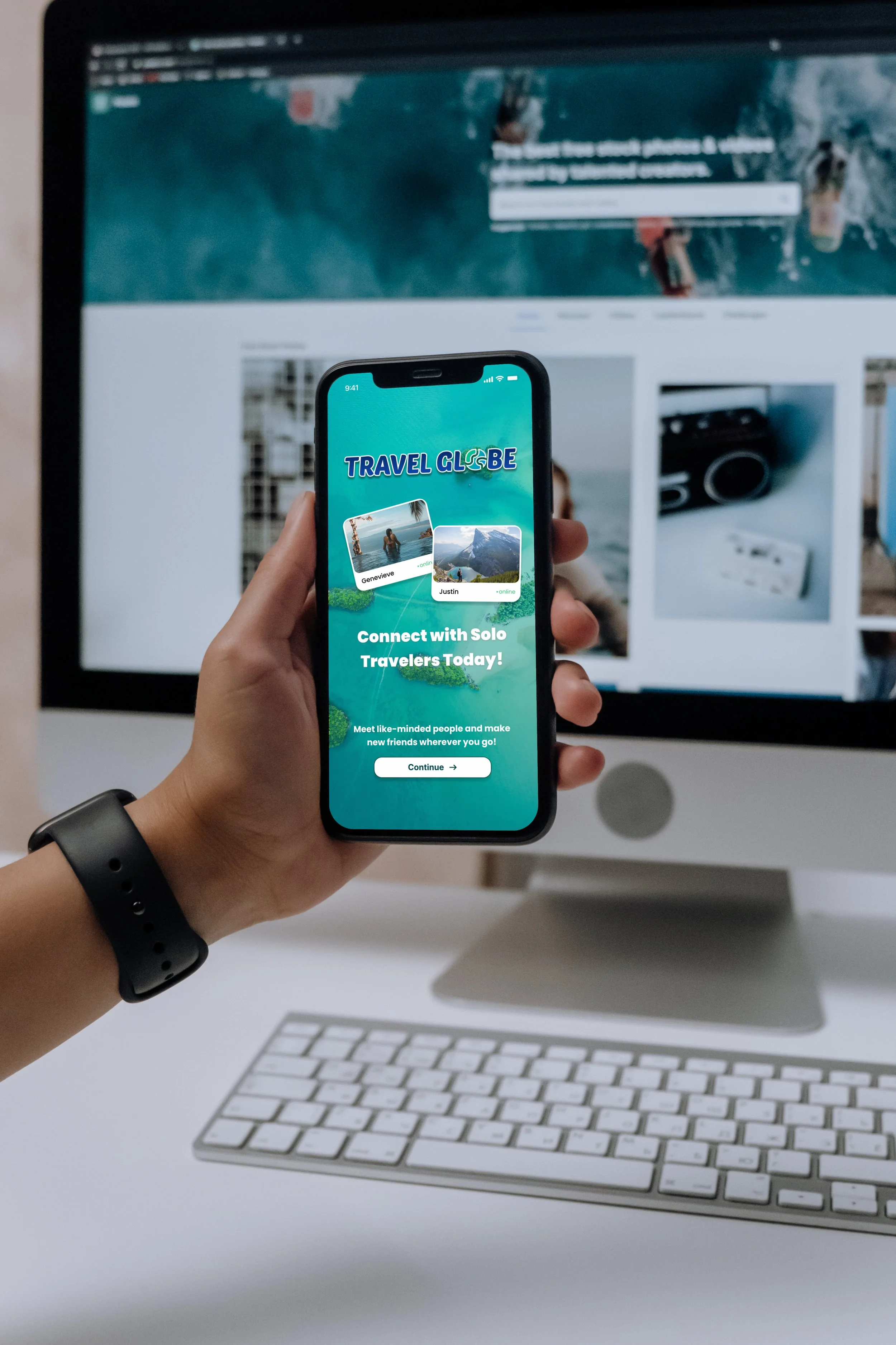
As a frequent traveler, I've often opted to book everything myself, as many third-party websites and apps can be quite confusing. Travelers desire a one-stop-shop for bookings that offers a sense of security and simplicity. That’s where TRAVEL GLOBE comes in!
The Problem
Many individuals aspire to explore the world as solo travelers, but the process of booking and finding a comprehensive solution can feel daunting. Concerns about safety, socializing, and choosing destinations suitable for solo adventurers often lead them to restrict their options.
The Solution
TRAVEL GLOBE addresses this challenge by offering an all-in-one solo travel app that connects solo travelers. Users can book safe activities, interact with fellow travelers in their vicinity, and enjoy peace of mind throughout their journeys. This app significantly enhances the overall travel experience, making it easier and more enjoyable for those exploring solo.
Research
As an enthusiastic solo traveler, I recognized the need for an app that caters to all travelers, regardless of their background. I approached my research with optimism, knowing the challenges of planning and booking trips can be stressful. To gain a comprehensive understanding of user needs, I sought participants from diverse backgrounds, allowing me to gather valuable insights. By incorporating this feedback, I aimed to create a product that truly resonates with solo travelers and enhances their experience.
Goal:
Recognize the unmet needs, emotions, and challenges individuals face when booking and traveling solo, while ensuring they feel supported by a comprehensive mobile app that fulfills all their travel requirements.
Research Methods
Competitive Analysis
Analyzed current websites and apps to uncover gaps in the booking process for solo travel. This assessment focused on identifying shortcomings and exploring opportunities for enhancement, aiming to improve the overall user experience.
User Interviews
I interviewed four individuals with diverse travel backgrounds, including a flight attendant, a travel blogger, and two seasoned solo travelers with over 20 years of experience. Each participant shared their unique stories and challenges as solo travelers, as well as their insights on what they would like to see in a future app.
User Survey
I interviewed four individuals with diverse travel backgrounds, including a flight attendant, a travel blogger, and two seasoned solo travelers with over 20 years of experience. Each participant shared their unique stories and challenges as solo travelers, as well as their insights on what they would like to see in a future app.
Key insights and opportunities
Challenges in Solo Travel
Respondents reported several common challenges, including difficulties in locating trustworthy groups of solo travelers to connect with, as well as the lack of comprehensive apps that support the entire solo travel experience. Participants voiced a strong desire for applications that provide localized advice and pricing transparency to address these issues. These insights highlight the need for practical solutions that enable solo travelers to navigate unfamiliar environments more effectively.
User Feedback and Suggestions
Participants identified several features that would enhance their solo travel experiences through mobile applications during the user survey.
Recommendations for solo-friendly accommodations (70.4%).
Trip planning and itinerary management tools (63%).
Community forums or chat options for connecting with other travelers (33.3%).
These preferences indicate that technological support, particularly in planning, safety, and community engagement, is crucial for enhancing the solo travel experience.
Affinity Map
Following my interviews and user surveys, I developed an affinity map to organize key insights by grouping similar responses regarding what users seek in a solo travel app. From this analysis, I identified eight distinct themes:
Favorite Destinations
Planning and Preparation
Technology and Apps
Desired Features in a Travel App
Respondent Profiles
Travel Experience
Activities
Social Connectivity
These critical findings provide a foundation for understanding the core needs of users, guiding me in the design of my app prototype.
Personas
I created three personas—a travel blogger, a recent college graduate, and an entrepreneur—to better understand the unique needs, goals, and challenges faced by different solo travelers. These personas represent the three primary user groups of Travel Globe, each highlighting specific pain points within the solo travel experience. By considering these diverse perspectives, I ensured that my solutions are user-centered, effectively addressing the needs of all types of solo travelers and resulting in a balanced and comprehensive platform.


DESIGN
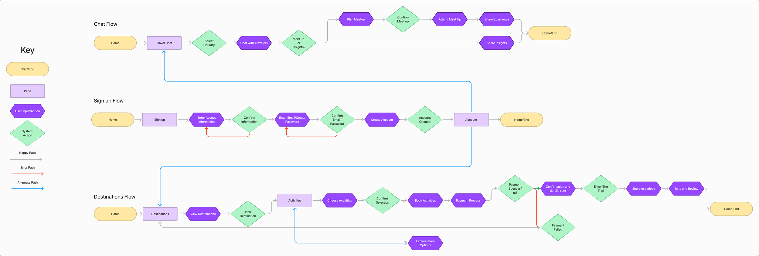
I developed three user task flows to facilitate seamless navigation throughout the various sections of the app. These task flows are designed to enhance user experience by simplifying access to each component of the application. The key flows include:
Creating a New Profile: Users will set up a new account to establish their user profile within the app.
Selecting Activities by Destination: Users can explore and book activities tailored to their chosen destination.
Joining a Chat to Connect with Solo Travelers: Users have the option to join chat groups that align with their interests, facilitating connections with fellow solo travelers.
User flows
Branding of travel globe
TRAVEL GLOBE is expertly crafted to empower solo travelers, providing them with a sense of safety, comfort, and ease as they navigate their journeys. The platform centers around three core values—Community, Empowerment, and Inspiration—that act as foundational principles to enhance the travel experience and cultivate a supportive network for individuals venturing out on their own. By promoting these values, TRAVEL GLOBE not only enriches the adventures of its users but also encourages a strong sense of connection among those exploring the world independently.

Name Meaning
The name “TRAVEL GLOBE" embodies the spirit of adventure, encouraging individuals to traverse the globe and uncover new destinations, cultures, and experiences.
Logo
The logo features a minimalist design that beautifully integrates the text "TRAVEL GLOBE" with a world icon, cleverly replacing the “O” in "globe." This design element, enhanced with rounded edges and an ombre effect, symbolizes a sense of tranquility paired with the thrill of discovering new places.
Color Palette and Typography
The color palette was carefully curated, featuring a harmonious blend of different shades of blues and teals, complemented by soft whites and a vibrant pop of orange. This combination reflects the tropical essence and adventurous spirit of traveling. For typography, I chose Poppins, a modern geometric sans-serif typeface known for its clean lines and excellent readability. This versatility makes it an ideal choice for the app, ensuring that users can easily navigate and engage with the content.
Overall, each aspect of TRAVEL GLOBE's design is purposefully crafted to resonate with solo travelers, providing them with not only the tools they need for a successful journey but also a sense of community and inspiration throughout their adventures. By prioritizing these elements, TRAVEL GLOBE fosters an environment that encourages exploration and personal growth, empowering users to fully embrace their travel experiences.
Low-Fidelity Frames
For my low-fidelity wireframes, I created a comprehensive layout of the key screens in Figma. The design includes three main components:
Creating a New Profile: This screen allows users to enter essential information such as their name, email, and preferences. The layout emphasizes simplicity and clarity to facilitate an easy onboarding experience.
Selecting Activities by Destination: This screen presents users with a visually engaging way to browse various activities tailored to specific destinations. It features a filter option, allowing users to refine their choices based on interests, duration, and pricing.
Joining a Chat to Connect with Solo Travelers: This screen enables users to connect with other solo travelers through a chat feature. The design includes a list of available chat rooms, user profiles, and an easy-to-use interface for initiating conversations.
Wireframes
High-Fidelity Frames
I moved directly to high-fidelity wireframes after completing the key elements in the low-fidelity stage, driven by my confidence in the foundation I built. In the UI stage, I made significant changes, including resizing buttons and adding frames to enhance task flows.
This phase became my favorite because it allowed me to bring my vision to life using branding elements like color schemes, images, and typeface. Incorporating interactive components also proved essential for usability testing, enabling me to gather valuable feedback and refine the user experience. Overall, this stage was about blending aesthetics with functionality, resulting in a design that is both visually appealing and user-friendly.
Usability Testing and Refinements
I conducted unmoderated usability tests using a third-party app called Maze, where I tested three user flows: Signing Up for a New Profile, Finding the Activities Section (Browsing, Picking, Booking, and Paying), and Finding the Chat Section (Picking a Destination, Reviewing Chats, and Joining a Chat). After the initial tests with three participants, I noticed significant issues due to the limitations of the Maze platform. To address these, I had participants complete the tasks using my Figma prototype, which resulted in much better outcomes
Feature 1: Onboarding/Profile Creation
Overall Success: Mostly Direct Success. Some Indirect Success due to bugs.
Positive Feedback: Easy navigation, nice design, clear instructions.
Negative Feedback:
Redundant information requests (e.g., destination already in bio).
Lack of a "skip photo" option.
"Nightlife" listed twice in activities (should be replaced).
Desire for activity reviews and filters.
Activity sections needed (by type: food, fitness, etc.) instead of one long list.
More activities desired.
Feature 2: Activity Selection/Date Planning
Overall Success: Mixed success, with unfinished missions and indirect successes due to bugs.
Positive Feedback: Clear labeling, nicely designed screens.
Negative Feedback:
Bugs preventing users from progressing.
"Lock in your date" button confusing (related to bugs).
Desire for activity reviews and filters.
More activities desired.
Feature 3: Chat/Social Features
Overall Success: Mixed success, with some direct successes but also unfinished missions and indirect successes.
Positive Feedback: Easy to find chat button.
Negative Feedback:
Chat not easily discoverable, should be more prominent (e.g., always in bottom toolbar).
More engaging chat features desired.
Destination selection issues (not clickable).
Redundant destination information (already in bio).
Need for a screen explaining the group and user verification.
Desire for "online" status indicator for users.
Key Issues and Recommendations
Bugs: Address the bugs that are sending users back to the onboarding flow and preventing them from completing tasks. This is the highest priority.
Redundancy: Remove redundant information requests (destination).
Navigation: Make the chat feature more prominent and accessible.
Content Organization: Organize activities into sections by type (food, fitness, etc.).
Features:
Add a "skip photo" option during profile creation.
Add activity reviews and filters.
Add more activities.
Refining the Prototype after usability testing
Figure 1 Problem
FIgure 2 Solution
Problem ( Figure 1)
The limited activity list frustrated users, who wanted more options and category organization. They felt restricted by the current design
Solution ( Figure 2 )
Users wanted more activities, so I created category-specific screens, like 'Water Sports,' for wider selection. This improved navigation and choice
FIgure 2 Solution
Figure 1 Problem
Problem ( Figure 1)
Users requested activity reviews, highlighting the need for peer feedback in decision-making. They wanted to know what other solo travelers thought
Solution ( Figure 2 )
Activity reviews were added, giving users peer insights for better choices. It also increased user engagement.
Future Roadmapping
If I had more time, I would conduct large-scale testing of TRAVEL GLOBE and further refine and enhance the app by incorporating features like verified user profiles and maps highlighting the best places to stay and explore in the area. However, I am proud of how this project showcases my ability to blend empathy, research, and design to address real challenges faced by users.
My Reflection
TRAVEL GLOBE is more than just an app design; it's about creating a meaningful experience for individuals seeking to explore new opportunities through travel. I understand that many people desire to travel solo but may feel apprehensive about taking that first step, which can often be daunting. Through my research, iterative design process, and a focus on user-centered design principles, I have developed a tool that not only facilitates these new experiences but also supports users in navigating their solo travel journeys with confidence and ease.
Lessons learned
The Importance of Usability Testing:
After conducting my usability testing with Maze, I realized that while it offers a straightforward approach to user testing, it also presents several challenges. The issue arose from screens moving around during the testing process, which created confusion for participants. In contrast, using a Figma prototype allows for precise control over interactions and screen flow, ensuring a more coherent and user-friendly testing experience. This comparison emphasizes the need for careful selection of tools in usability testing to effectively assess user experiences and gather valuable feedback.
Early and Iterative Testing:
Conducting testing early in the low-fidelity stage and again on the high-fidelity prototype highlighted how valuable feedback is at every step. Early testing helped refine the structure, while later testing ensured the final design met user needs.